Color theory for character design is the strategic use of hue, saturation, and value to shape how your audience feels about a character before they say a single word. It goes far beyond picking pretty colors. When applied with intention, color becomes your most powerful storytelling tool — one that signals personality, drives emotion, and makes your character unforgettable. This guide gives you a step-by-step system to master it.
What Is Color Theory in Character Design?
Color theory in character design is the purposeful application of color principles to communicate personality, emotion, and story role through a character’s visual appearance. Unlike general color theory — which focuses on mixing, harmony, and contrast in abstract terms — character-focused color theory asks a very specific question: What does this color make the audience feel about this person?
A character’s color palette isn’t decoration. It’s data. Think about how instantly you recognize Spider-Man’s red and blue, or how the sickly greens of a villain signal danger before they even speak. That’s color psychology in character design working at full power.
Here’s why it matters for your work:
• Emotion control — color sets the emotional tone before dialogue
• Personality signaling — warm, cool, muted, or vibrant colors all say something
• Visual hierarchy — color guides the eye to what matters most
• Memorability — a strong palette makes a character stick in memory
• Story reinforcement — color shifts can show character growth or corruption
The 3 Core Elements of Color Theory
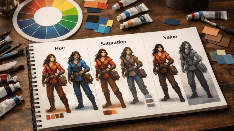
Hue — Choosing the Emotional Direction
Hue is the basic color family: red, blue, green, yellow, and so on. It’s your first emotional decision. Warm hues (reds, oranges, yellows) feel passionate, aggressive, or nurturing. Cool hues (blues, purples, greens) feel calm, mysterious, or distant.
How it affects characters: A fire-wielding hero in reds and golds feels energetic and bold. That same character in cool blues suddenly feels withdrawn or untrustworthy.
Common beginner mistake: Choosing hue based on aesthetics alone, ignoring what it communicates emotionally.
Quick tip: Before picking any color, write down 3 personality traits for your character. Then find hues that naturally match those traits.
Saturation — Controlling Intensity and Attention
Saturation controls how vivid or muted a color appears. High saturation = bold, energetic, and attention-grabbing. Low saturation = subtle, tired, complex, or morally grey.
How it affects characters: Heroes in animated shows like those in Genshin Impact often use high-saturation palettes to feel exciting and heroic. Tragic or morally complex characters tend toward desaturated, dusty tones.
Common beginner mistake: Cranking up saturation on every color, which creates visual chaos and makes the character feel flat.
High saturation = energetic hero | Low saturation = complex, morally grey character
Value — Creating Depth and Readability
Value refers to how light or dark a color is. It’s arguably the most important element in character design because it controls readability at any size. Strong value contrast between a character’s skin, clothing, and hair creates a clear, readable silhouette.
How it affects characters: Characters with high value contrast (dark outfit, light skin) read instantly even at thumbnail size. Low value contrast muddles the design.
Common beginner mistake: Relying on hue differences without checking value — the result is a muddy design that disappears at small sizes.
Low value contrast = muddy design | Always run a grayscale test before finalizing
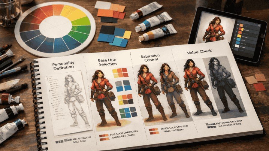
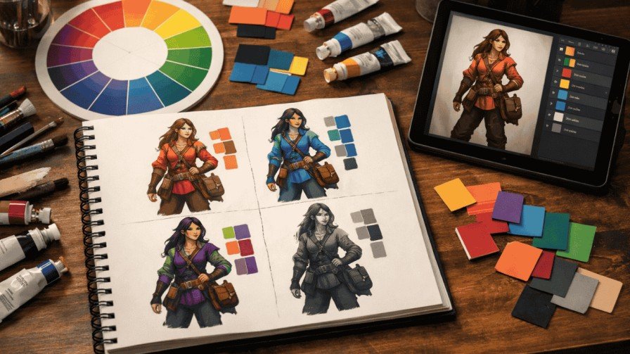
How to Choose a Color Palette for a Character (Step-by-Step Framework)
This 6-step system is your repeatable process for building strong character design color schemes from scratch — no guessing, no random picks.
1. Step 1: Define your character’s core personality trait. Pick one dominant word: brave, corrupt, nurturing, cold, chaotic. Everything else flows from this.
2. Step 2: Choose an emotional color family. Match your personality trait to a hue family. Brave = warm reds/golds. Cold = deep blues. Chaotic = clashing complementary hues.
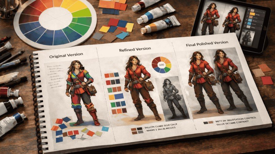
3. Step 3: Select your dominant color (60%). This color covers the most visual real estate — usually clothing or overall appearance. It anchors identity.
4. Step 4: Add a secondary support color (30%). This complements or contrasts your dominant. It adds depth without competition.
5. Step 5: Add your accent color (10%). This is your pop — use it sparingly on eyes, accessories, or key details to draw attention exactly where you want it.
6. Step 6: Test in grayscale. Strip all color and check readability. If the design still reads clearly, your value structure is solid. If it blurs together, adjust.
Spider-Man: Into the Spider-Verse is a masterclass in this framework. Each Spider-Person uses a distinct dominant hue, supporting color, and accent — making them instantly separable even in crowded scenes.
Color Psychology for Character Design
Primary Emotional Associations
Red isn’t just anger. A soft rose-red reads as romantic and vulnerable. A deep crimson reads as dangerous and powerful. Context, saturation, and value completely change how a hue lands emotionally. Never reduce color psychology to single-word labels.
Cultural Variations in Color Meaning
White signals purity in Western storytelling but mourning in several East Asian traditions. Purple represents royalty in European contexts but can feel spiritual or supernatural elsewhere. If your character exists in a specific cultural world, research how colors land in that context.
Subverting Color Expectations
The most memorable characters often break color rules deliberately. A villain dressed in bright, saturated pastels (think certain animated antagonists) feels deeply unsettling because the color says ‘safe’ while the behavior says ‘danger.’ That tension is powerful storytelling.
| Color | Standard Read | Subverted Read |
| Red | Passion / Danger | Sacrifice / Vulnerability |
| Green | Nature / Growth | Toxic / Envy / Corruption |
| Purple | Royalty / Power | Isolation / Melancholy |
| Yellow | Energy / Joy | Madness / Cowardice |
Using Color to Show Character Relationships
One of the biggest gaps in most character design tutorials is relationship color logic. Your characters don’t exist alone — they exist in context with each other. Color harmony for characters should tell us about their dynamic before the story even begins.
Complementary colors (opposites on the color wheel) signal rivalry or tension — think classic hero vs. villain pairings. Analogous colors (neighbors on the wheel) suggest harmony, alliance, or shared worldview. In The Incredibles, each family member’s suit shares the same dominant red, visually reinforcing unity even when their personalities clash.
To prevent characters from visually blending together, ensure strong value contrast between characters who share screen time. Give protagonists and antagonists distinctly different color temperatures — warm versus cool is the simplest and most effective approach. Palette separation is key: every major character should own a distinct visual identity that doesn’t compete with others in the same scene.
Visual Hierarchy: Making Your Character Stand Out Instantly
Visual hierarchy in character design means controlling where the eye goes first. The answer should almost always be the face. To achieve this, the face needs the highest value contrast against surrounding elements — hair, collar, or background.
Practical techniques to test your hierarchy:
• Squint test: Squint at your design. The areas that still pop are your focal points. If the face disappears, you need more contrast there.
• Thumbnail test: Shrink the design to 100px wide. If it still reads clearly, your silhouette and value structure are solid.
• Desaturate test: Remove all color. If the design loses readability entirely, your value and saturation choices need work.
Clothing should generally sit at lower contrast than the face. Background interaction matters too — a light-clothed character needs a darker environment to pop, and vice versa.
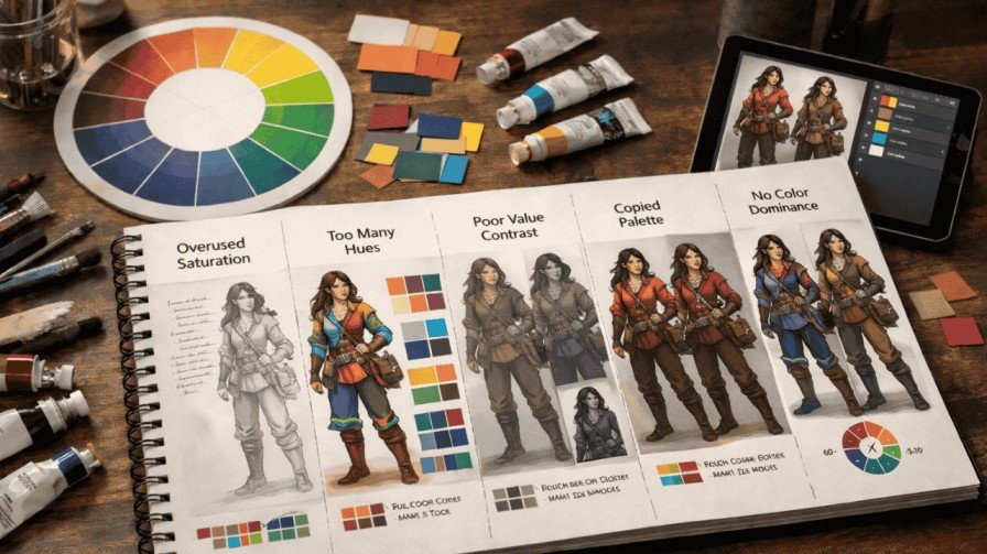
Common Color Mistakes in Character Design
• Overusing saturated colors: Every color competing at full saturation creates visual noise. Let one color dominate.
• Too many hues: More than 3-4 distinct hues in a palette makes the design chaotic. Limit your color count.
• Ignoring value contrast: Saturation differences don’t replace value differences. Always check in grayscale.
• Copying palettes blindly: Referencing is fine; cloning is lazy and creates derivative designs that don’t serve your specific character.
• No color dominance plan: Without the 60-30-10 framework, palettes feel random and visually unstable.
Advanced Techniques for Professional-Level Character Color
Once your fundamentals are solid, these techniques push your work into professional territory. Color scripting means planning how a character’s palette shifts across an entire story — a hero might start with warm, saturated colors and shift to cooler, more muted tones as they’re corrupted or broken.
Limited palette mastery forces creative constraint. Working with just 2-3 colors teaches you to use value and saturation variations for richness rather than adding new hues. Atmospheric lighting influence means the character’s palette should shift based on the environment’s color temperature — a character in golden-hour light should have warmer shadows. In 3D animation and 3D character art styles, this is handled through lighting rigs, but in 2D, you have to paint it deliberately. Render Edge Studio has excellent breakdowns of how professional studios handle palette consistency across a full character roster.
Accessibility and Readability in Character Color
Most character design tutorials skip this entirely — and that’s a mistake. Approximately 8% of men have some form of color blindness, which means red-green distinctions are invisible to a significant portion of your audience. Relying solely on hue to differentiate characters is a design failure.
The solution is value contrast. Characters separated by strong light-dark differences remain distinguishable regardless of color vision. Silhouette strength is your backup system — if two characters can be distinguished purely by outline shape, color becomes supplementary rather than essential. This also connects to shape language in character design, where form and color work together to build instant recognizability. Always test your final design in grayscale.
Quick Character Color Case Study
Character: Kael, a former royal guard turned rogue mercenary.
Personality breakdown: Disciplined but morally compromised, powerful but hollow.
• Dominant color (60%): Desaturated dark teal — signals past loyalty and current coldness
• Secondary color (30%): Worn gold — remnant of royal service, now tarnished
• Accent color (10%): Deep crimson — hints at violence and moral compromise
Logic: The desaturated palette shows someone drained of idealism. The gold remnant creates immediate backstory — the audience senses this character had status once. The crimson accent on weapon details signals danger without screaming villain. The grayscale test confirms strong value contrast between the dark teal body and light gold trim. This is color theory for character design doing exactly what it should — telling a story before the character speaks.
FAQ — Color Theory for Character Design
1. What is the best color for a main character?
There’s no universal answer — it depends on personality. Warm, saturated colors (reds, oranges) work well for energetic, bold protagonists. Cool, muted tones suit complex or stoic leads. The best color is the one that immediately communicates who your character is.
2. How many colors should a character have?
Stick to 3 core colors using the 60-30-10 rule. Dominant (60%), secondary (30%), accent (10%). Beyond that, you risk visual clutter. More hues doesn’t mean more interesting — it usually means less readable.
3. How do I make my character’s colors stand out?
Focus on value contrast first, then saturation. Ensure the face has the highest contrast in the design. Use the squint test and thumbnail test to verify your focal point reads clearly at any size.
4. Can villains use bright colors?
Absolutely — and it’s often more effective than defaulting to dark palettes. A villain in bright, cheerful colors creates cognitive dissonance that feels genuinely unsettling. Color subversion is a powerful storytelling tool.
5. How do I fix a muddy color palette?
Run your design through a grayscale test. Muddy palettes almost always suffer from low value contrast, not poor hue choices. Separate your lights and darks more dramatically, and reduce the number of competing saturated colors.
Final Thoughts
Before you finalize any character palette, run through this list:
• Clear emotional direction tied to personality
• 60-30-10 color dominance plan in place
• Strong value contrast between face, clothing, and background
• Limited saturation — one dominant, others supporting
• Tested in grayscale for silhouette strength
• Palette fits the character’s story context and arc
• Distinct enough from other characters to avoid visual blending
Color theory for character design isn’t about rules — it’s about intention. Every choice you make should serve the story. Save this checklist, revisit it with every character you build, and watch how your designs start communicating on a level most artists never reach. If you want to dive deeper into the visual language of character creation, explore how shape language in character design and 3D character art styles work alongside color to create truly unforgettable characters.